Monochrome interiors can be boring or wow. We will tell you how to prevent the first and achieve the second.
When we talk about a monochrome interior, we mean a color palette of several related shades, and not a single color that completely absorbs the space. Such an interior can admit to itself other auxiliary shades: neutral or contrasting.
Let’s turn to the classic color formula “60-30-10” (or “60-30-30”), which allows you to organically combine different shades in the interior. 60% of the visible space is occupied by the main color, 30% – by an additional helper shade, and another 10% (or 30%) receives a contrasting accent color, usually bright.
In the case of a monochrome interior, shades-assistants are close relatives of the main color, and the place of the accent color is usually taken by white, black or neutral natural shade. It will not be possible to use exactly three colors in space; some auxiliary tones will still appear in furniture finishing, on textiles, in decor. In monochrome designs, it is recommended to use no more than five shades.
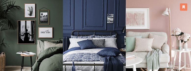
Only calm
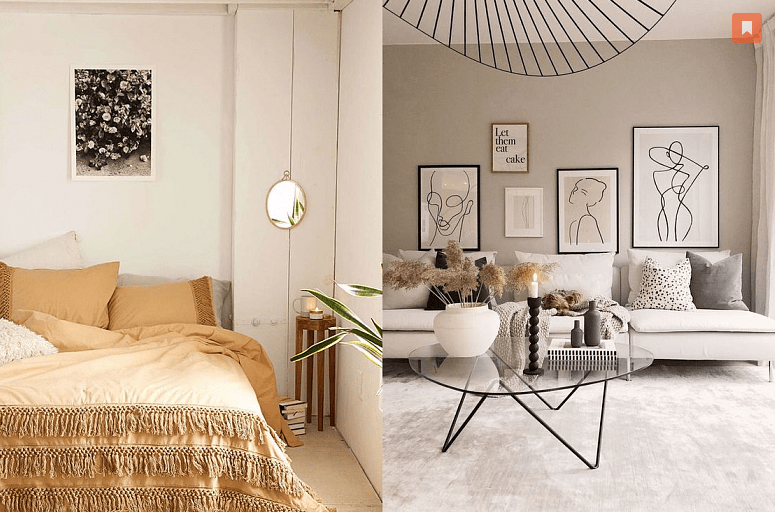
Totally beige interiors have had a bad reputation since the era of European renovation. The color is not to blame for anything. Beige can only look dull and old-fashioned if the interior itself looks dull and old-fashioned. Thoughtfully designed, the beige shade looks elegant, invites calm, evokes natural associations and rests the eyes.
Another neutral color with a dubious interior reputation is gray. He is often accused of being dull and lethargic. Although just a few years ago, gray mono interiors were a hot trend. And for good reason. Gray, like beige and other natural shades, is a color that exists outside of fashion, not fatiguing, neutral, and therefore a win-win. In the skilled hands of a designer, gray and beige shades will not look boring.
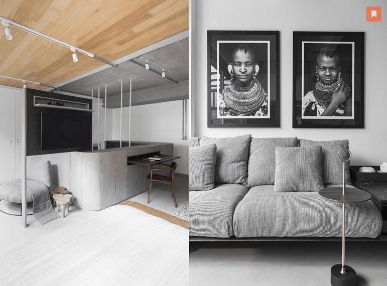
In order not to visually overcool the interior in gray tones, use a light wood contrasting in color temperature – the gray space will immediately become more comfortable.

Wow effect
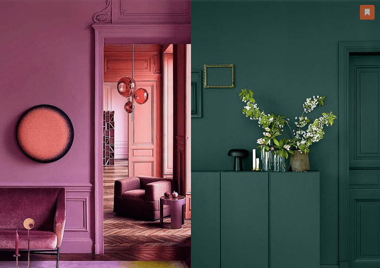
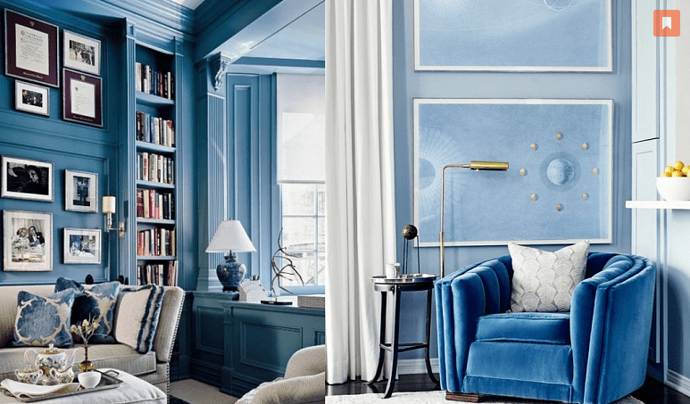
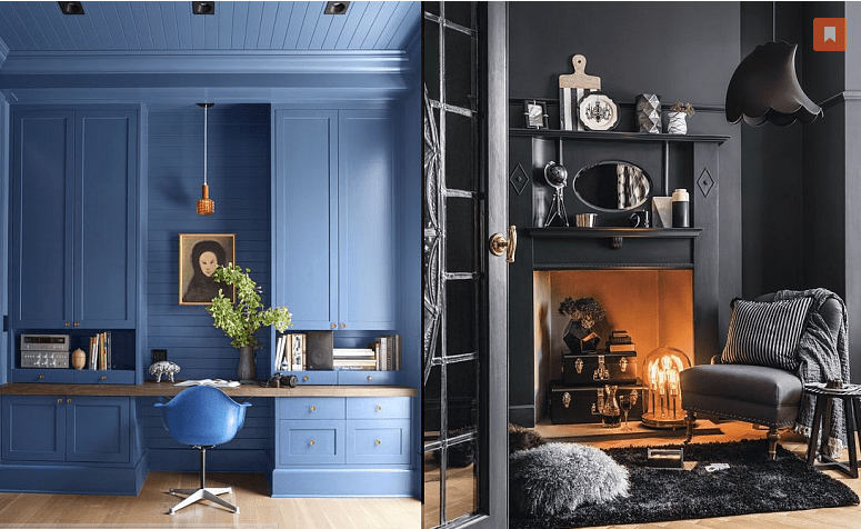
If you want a spectacular show, choose a bright or dark color. This technique works well in a small room. A particularly interesting emotional effect can be achieved if it adjoins a spacious and bright room – as if you are looking into an outlandish box or secret room.
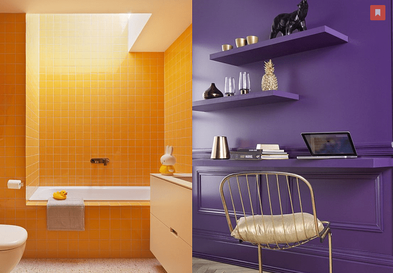
To enhance the extravagant effect, you can refuse contrasting infusions of color. The floor of the wall and the ceiling in a single shade will blur the visual boundaries of the space. Ideally suited for the role of a “box” are: a study, a dressing room, a kitchen area, a bathroom and a toilet
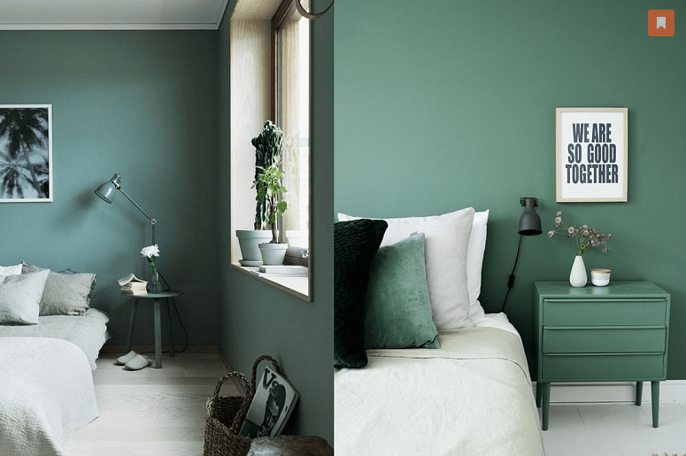
For a mono-bedroom interior, neutral light colors are well suited, as well as relaxing muted greens and blues. Bright colors are not recommended.