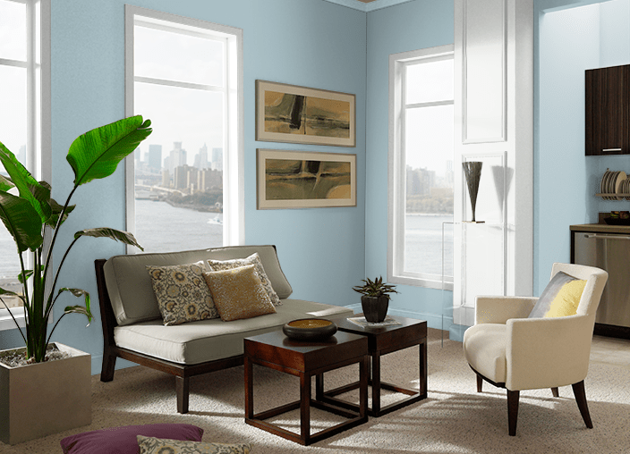
Choosing the ideal paint color for your living room requires finding a shade that is both versatile and ageless while also reflecting your particular style. “ living rooms are frequently the hub of the home,” explains Arianna Cesa, associate manager of color marketing and development at Benjamin Moore.
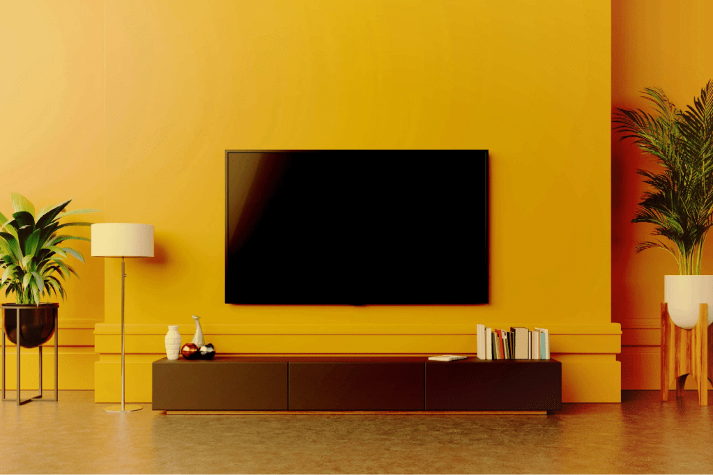
Babouche – the sunny yellow
Brighter colours, which signal a return to normalcy, will be welcomed in 2022. The bright, straightforward Babouche is ideal for doing so; while vibrant, it never feels gaudy or overwhelming.
“This shade of yellow is regarded as’subdued sunshine,’ after the characteristic colour of the leather slippers worn by Moroccan males. Despite its brilliant tone, it isn’t excessively bright or overwhelming, making it ideal for a bigger space where its cheerfulness will be amplified “Kayleigh explains. “When it comes to décor, go for more minimalist partners like simple line designs or subtle brilliant colours.”
This buttery yellow can serve to lighten a room with limited natural light,, and when looking at the colour wheel, it goes nicely with a delicate blue or a soft pink/red.
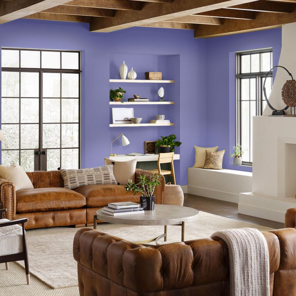
Pantone’s Very Peri
Pantone’s Color of the Year for 2022 is the most exciting ever, with a completely new hue produced specifically for the role of Color of the Year for the first time ever. It’s known as Very Peri (17-3938). The brand-new blue, a vivifying violet with electric red overtones, embodies consistency and vitality, as well as consistency and excitement. Last year, the institute surprised us with two new tones, Ultimate Gray (17-5104) and Illuminating (13-0647), because we all needed a bit more colour as we approached the end of the decade. Very Peri is with us this year as we leave from our solitude and into a new digital and physical world.
Of course, the significance of Very Peri’s conception is reflected in its nature. Laurie Pressman, Vice President of the Pantone Hue Institute, states, “Creating a new colour for the first time in the history of our Pantone Color of the Year educational colour programme symbolises the global innovation and transformation taking place.” “The richness of this new red-violet-infused blue tint emphasises the vast possibilities that lie ahead.”
Very Peri looks great with neutrals like taupes and creams, as well as darker colours like navy and brown. Try it on pillows, wallpaper, or art when it comes to decorating. Don’t be afraid to mix and match textures like velvet, leather, and grasscloth. The wonderful thing about this vibrant colour is that it invites originality and expression, so try something different (with Very Peri at the forefront of your design).
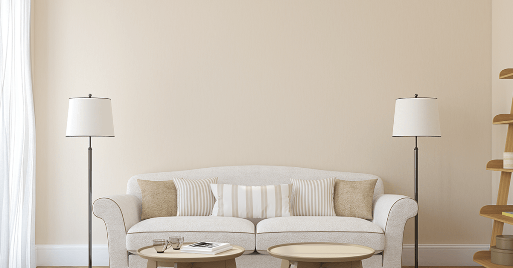
School House White – the updated neutral
“A soft, off-white shade, ’School House White’ is designed to look like white in a shaded area. Muted, timeless, and comfortingly familiar, this shade evokes the nostalgia of old schoolhouses,” says Kayleigh. “Due to its grounded, unassuming hue, this shade would pair easily with virtually any other colour. Ideal for a background on which to feature dramatic, largescale , or even vibrant, statement rugs, it’s hard to go wrong with this particular shade of white.”
“‘School House White’ is a soft, off-white tint that is designed to seem white in a shady environment. This tone is muted, ageless, and comfortingly familiar, evoking memories of ancient schoolhouses “Kayleigh explains. “This shade would go well with almost any other colour because of its grounded, modest hue. It’s difficult to go wrong with this specific shade of white as a backdrop for dramatic, large-scale artworks or even vivid, statement rugs.”
If you want to combine numerous 2022 colour trends, this hue will amp up the power of Babouche.
Evergreen Fog
Evergreen Fog is ageless because it’s not excessively verdant, it’s a little gentler and delicate. It’s a versatile mid-tone that allows you to personalise your space without going overboard with dramatic or bright colours. This nutritious, classy gray-green with a hint of blue goes with a wide range of design types and décor. In terms of interiors, it’s a really innovative take on cabinet storage in a mudroom, pleasant for a relaxing environment like a living room or bedroom, and makes a subtle statement in a bathroom.
It’s also a natural fit for the outside. Because of the grey tones, it would be a light splash of colour to welcome visitors into your house and provide a relaxing welcome before they even walk through the door. Evergreen Fog would look fantastic in any part of the country. The hue for exteriors is extremely flexible from the Pacific Northeast to Florida.” The Method palette from Sherwin-Williams’ 2022 Colormix Forecast offers complementing tones and inspiration.
Incarnadine – the comforting red
“Incarnadine is a rich, warm, and oh-so-comforting scent. This colour combines traditional red with the relaxed attitude of the Mediterranean “Kayleigh explains. “Warm woodwork and rustic gold accents would look fantastic with this colour. If you want to go for a more edgy look, mix it with a brilliant white shade.”
Combine this glossy tone with a monochrome palette for a more contemporary look, or go for extravagance with plenty of velvets, deep forest greens or inky blues, and classic antique furniture for a more opulent look.
Behr’s Breezeway
For 2021, Behr led households to Elevated Comfort, a sumptuous getaway (a palette organised into six restful colour themes like Subtle Focus, Calm Zone and Quiet Haven). It’s time for Breezeway (MQ3-21), a light, silvery-green shade with cold undertones that evokes glinting bits of sea glass, after a year of nesting. The hue nudges us to embrace the outdoor activities and pleasures that inspire us, and the name emphasises the movement from one location to the next. (Behr’s Color Trends 2022 Palette rekindles our spirits with a wide range of complementing tones.)
The appeal of this hue is based on its versatility. Erika Woelfel, vice president of colour and creative services at Behr Paint Company, says, “Breezeway’s hue serves as the base for a number of design styles, going seamlessly from casual to coastal, modern to retro styling suitable for home offices and living areas.” “Given how much time we spend in our living rooms and offices, it’s critical to choose a brightening colour like Breezeway to lighten these spaces.”
Bright Skies – the hopeful blue
“This light and breezy shade brings new life to any decor,” Kayleigh comments. “When consumers apply this tone on their ceilings, it will be a game-changer, according to Marianne Shillingford, Creative Director of Dulux, who says it makes the ceiling’melt away.’ This colour is both uplifting and light, as well as relaxing, familiar, and appropriate for a happy sanctuary. The aftermath of the pandemic affected Dulux’s choice, with many of us yearning for independence, expansion, and a return to nature.”
This colour has the potential to become the new grey, signalling a shift away from neutrals and toward colour.